The volume creep: How Mac OS lost its quiet confidence
My son and I recently spent four days building a custom Windows gaming PC from scratch. After finally getting Microsoft Windows 11 to boot, something unexpected caught my attention during the first-time setup: Windows had become...quiet.
The Windows out-of-box experience was clean, minimal and respectful of my attention. And in that moment, I realized something that had been nagging at me for years—Mac OS had gone in the opposite direction. Somewhere along the way, Apple's operating system had lost its famous restraint and become... loud.
A tale of two operating systems
As someone who's used Mac OS daily for over 30 years, I've watched this transformation happen in slow motion.
The contrast between Windows and Mac OS used to be stark: Windows was cluttered and aggressive, constantly demanding attention. Mac OS was the zen alternative—thoughtful, calm and purposeful.
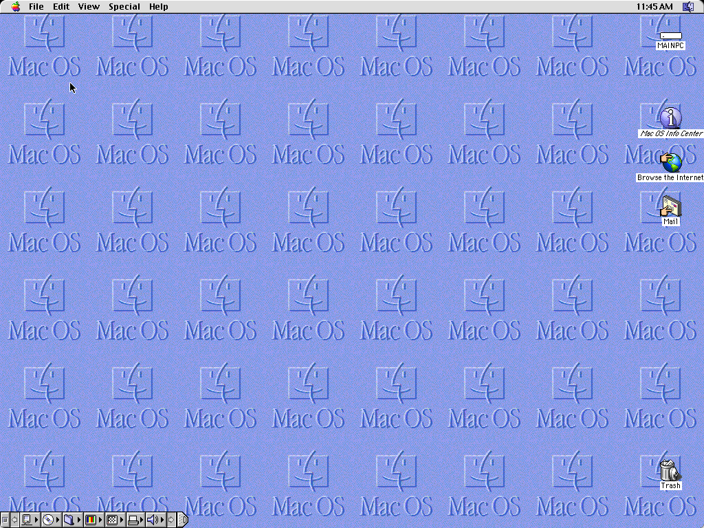
Today, that difference has largely evaporated. In some ways, the roles have reversed.
The difference maker is probably that we'd followed guidance for how to bypass the Microsoft account sign-in during installation, instead using the local account setup route instead.
This one decision had a big impact.
Without the Microsoft account integration, Windows skipped the promotional offers and cloud service pitches that often clutter the user experience. The result was remarkably restrained—just the operating system, ready to use and without the noise.
It was a revelation: Windows could still be quiet, but only if you knew how to say no to its ecosystem.
Death by a thousand features
Open a new Mac for the first time now, and you're greeted by an avalanche of prompts, tips and suggestions:
- Widgets sliding in from the side
- Apple Intelligence wanting to introduce itself
- Hot Corners lighting up edges of the desktop
- Stage Manager offering to reorganize your windows
- iCloud prompts appearing at every turn
- Continuity features asking for permission
- Siri suggestions popping up unprompted
Each feature, considered individually, might seem reasonable. But together? They create a wall of noise that undermines the very simplicity Mac OS was once famous for.
The inversion problem
The philosophy has fundamentally shifted. Mac OS used to present you with smart, quiet defaults—carefully chosen settings that worked for most people, most of the time. If you wanted more, you could opt in.
Now, you're opted into everything by default. Your first hour with a new Mac isn't about getting to work—I find it's about turning things off. You're not customizing; you're defending your attention span.
This isn't how great software should work.
What I imagine happened behind the scenes
I purposely try to avoid expressing negative opinions about other peoples' creations or implementations of their ideas on the Internet. That's not to say I haven't done so before - I regrettably have - but after being on the receiving side of that "feedback", it hurts to be publicly criticized and I don't want to inflict that on others.
That's why writing this article is hard. I have a lot of respect for Apple and its product teams: its designers, developers, testers and managers. They've set the bar so high for so long.
That said, with newer versions of Mac OS you can almost hear what took place in product meetings: teams passionately arguing why their feature deserves prominence in the first-run experience. Marketing and sales wanting more, more and more.
And too many of those teams have won.
The result isn't bad features—Apple generally ships very high quality work—but rather a lack of editorial discipline. There's no strong voice saying "No, that's one prompt too many." or "This can wait until the user needs it."
As a result, every product team seems to gets their moment in the spotlight...and the end user pays the price.
Why smart defaults matter
This isn't just about aesthetics or nostalgia for simpler times. It's about cognitive load.
When users are bombarded with choices, prompts and features from the moment they power on, several things happen:
- They become overwhelmed and make worse decisions
- They skip reading important information (permission prompts become noise)
- They develop negative associations with the product from the start
- They miss the features that would actually help them
A cluttered first-run experience doesn't showcase your features—it buries them.
Lessons for software user experience design
This evolution has already influenced how I think about design decisions in our own product work:
1. Smart defaults are an act of respect
Don't ask users to make decisions they're not equipped to make yet. Make the right choice for them and let them override it later if needed.
2. Silence is a feature
The ability to use software without constant interruption isn't the absence of features—it's one of the most valuable features you can offer.
3. Not every feature deserves a billboard
Just because you built something doesn't mean it needs to introduce itself on first launch. Discoverability can be gradual.
4. Calm systems scale better
As your product grows more complex, restraint becomes more important, not less.
A path forward
Yes, Mac OS had far fewer features 30 years ago. But the contrast between then and now isn't just about feature count—it's about editorial courage.
The best products know what to leave out. They understand that every prompt, every animation, every "helpful" suggestion has a cost. And they're willing to pay the cost of saying no to good ideas in service of a great overall user experience.
Windows seems to have learned this lesson—or at least, it can still deliver a quiet experience if you're willing to opt out of its ecosystem during setup. One can only hope that Mac OS remembers what made it special in the first place.
In the meantime, for the rest of us building software, we have a choice to make: Do we follow the path of more and louder? Or do we have the discipline to stay calm, quiet and respectful?