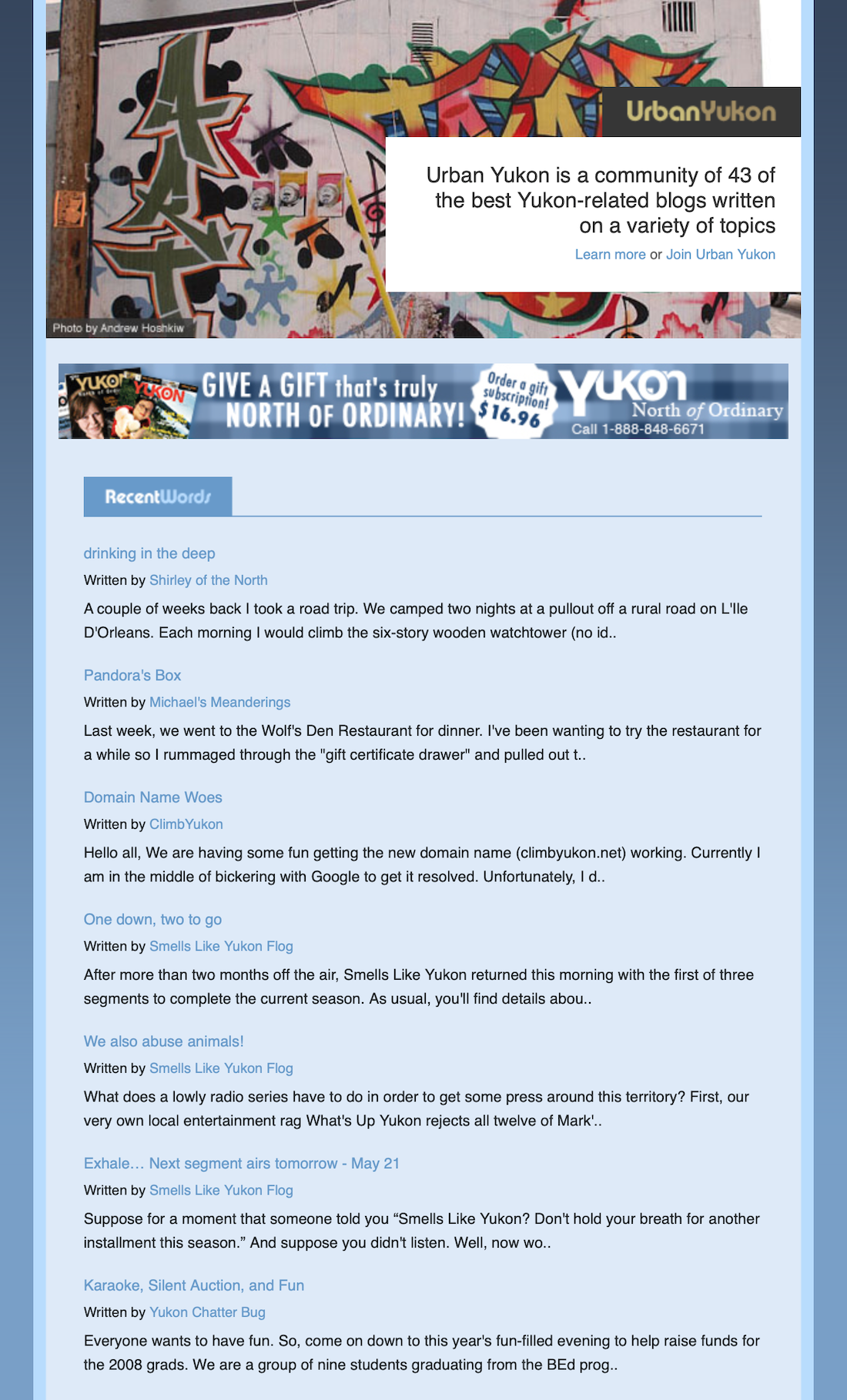
Urban Yukon redesigned
Since I started Urban Yukon back in March 2006, the basic visual design has stayed intact, with some minor tweaks here and there. As the community has grown and the site audience has greatly expanded, the previous version was being stretched to the limits.
In order to keep up with these changes, I have rebuilt the website from scratch, utilizing ExpressionEngine as the behind-the-scenes publishing system. Going with ExpressionEngine means that I can easily add more features and functionality in the future, while still making it simple to maintain the membership list; once an arduous task.

Upon review of how people were using the website, I concentrated on the homepage design first because it was clearly the most important.
More than 70% of the traffic to the website is repeat visits; most people regularly check back throughout the day to see what's new. This helped me decide to go with a narrow layout, driving the focus purely on content. The beautiful images contributed by Andrew Hoshkiw directly aligned with this vision, and I was off to the races, er, Photoshop.
Speaking of photos, I've had several requests to include them in Urban Yukon. After all, we do live in one of the most amazing places on earth and many Urban Yukon members are also photographers. So, at the bottom of the homepage you'll see a section entitled Random Photos. These are images from individual photo RSS feeds. If you've got a photo gallery RSS feed that I don't know about, please contact me and I'll add you to the list (this area is a little slow to load at present, but I'm working on it).
After I finished the homepage, I concentrated on improving the navigation to and layout of member profile pages. Last November I asked Urban Yukon members if they'd be interested in having their blogs sorted into categories, the response to which was a resounding no. Rather, most folks wished to keep their blogs wide open, so instead I implemented a search engine that allows visitors to search by author name or location.
Head to any member page and type in a query, say whitehorse. All of the blogs written by a resident of Whitehorse will appear. Same with faro. Same with blogs for guys named andrew.
You'll also notice that Urban Yukon now has advertisements. This is something I've been wanting to try for a long time, but I knew I wouldn't be satisfied with standard (yet quick to implement) text ads, so I designed my own.
Other changes include new promotional buttons to match the updated colour scheme, a standardized form by which to submit membership applications and, for the geeks, a much cleaner link structure; good-bye question marks and ampersands.
So, am I completely happy with the redesign? Sadly, no. But will I ever be happy with anything I create? Likely not, but that's okay.
Urban Yukon has always been, and will remain to exist as an experiment. A labour of love for Yukoners and those interested in the Yukon.That's what I dig about the whole concept. I hope you feel the same way.